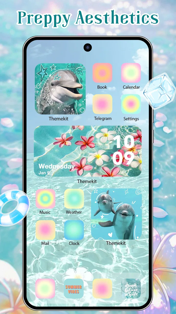
ThemeKit - Themes & Widgets
- 4.6
- Rating
- 50.00M
- Installs
- Free
- Price
 Analysis by App-foxy
Changing a phone’s appearance usually sounds easier than it feels. One wallpaper may look good, but the icons, widgets, and spacing can still make the home screen feel unfinished. My experience with ThemeKit - Themes & Widgets is that its real value lies in bringing those pieces together instead of treating personalization as a single background image. It is a free personalization app from ThemeKit, aimed at people who want a more deliberate home-screen style without building every element from scratch.
The app has become a widely used option, with a 4.7 average from around 625 thousand ratings and more than 50 million installs. That popularity does not make every design a perfect fit, but it does suggest that the basic idea works for a large audience. I found it most interesting when I stopped looking at it as a wallpaper collection and used it as a way to create a consistent visual mood across the phone.
Why the complete theme matters more than a single wallpaper
The central capability is coordinated customization. Instead of choosing a background first and then searching separately for icons or widgets that only vaguely match, ThemeKit puts those choices into a shared visual direction. That changes the result in a practical way: the home screen feels planned, even when the user has not spent much time designing it.
You May Also Like

 AccuWeather: Weather Radar
AccuWeather Review: A Quick, Clear Forecast for Everyday Decisions
For everyday plans, the best forecast is the one you can understand quickly. AccuWeather makes rain timing, radar, and local conditions easy to act on, with a few trade-offs.

 Hill Climb Racing
Why Hill Climb Racing Still Turns Crashes Into One More Run
A tiny car, a bumpy hill and one more upgrade: Hill Climb Racing keeps resurfacing because its simple chaos makes every near-miss feel personal.

 AliExpress - Shopping App
AliExpress Makes Global Shopping Feel Personal, but Shoppers Bear the Risk
AliExpress turns a global marketplace into a pocket-sized discovery engine. Its reach is useful, its shopping loop compelling, and its trade-offs easy to miss.

 Lords Mobile: Kingdom Wars
Lords Mobile Is a Kingdom-Building Routine, Not a Quick Match
A case-by-case verdict on the building, battles, device demands, and social commitments that make Lords Mobile rewarding for some players and exhausting for others.

 PDF Scanner app - TapScanner
TapScanner Makes Paperwork Easier to Capture, Check, and Share
TapScanner makes scanning with a phone feel less like a rescue operation and more like a dependable step in getting work done. Its capture tools are useful, though not flawless.

 Block Blast!
 Shows How Much a Puzzle Game Can Leave Out
A quiet grid game shows why puzzle players increasingly value instant clarity, repeatable skill and low-pressure play—and where the genre still needs to catch up.
More From Our News Desk
View All News

This matters especially on a busy phone. A dark wallpaper with bright, unrelated app icons can look noisy. A soft image paired with heavy widgets can feel equally mismatched. A theme that considers the background, icon treatment, and widget appearance together gives the eye fewer competing elements. I noticed that the improvement was less about making the phone look dramatic and more about making it feel calmer and easier to read.
The app’s store summary points to themes, icons, widgets, and wallpapers, but the useful distinction is how those parts influence one another. A wallpaper is passive; it sits behind everything else. Icons and widgets occupy the areas I actually scan while opening an app or checking information. When those elements share colors and visual weight, the home screen becomes more coherent instead of merely decorated.
The strongest feature is not the number of visual choices; it is the reduction of design decisions needed to reach a consistent result. That is a meaningful advantage for anyone who likes a polished phone but does not want to learn graphic design or spend an evening matching colors manually.
What I look for before applying a style
I do not judge a theme only from its preview. I first consider whether its background will leave enough contrast for text and whether its icons will remain recognizable at a glance. Very detailed wallpapers can look impressive in a gallery but become distracting once app labels and widgets are placed over them. Likewise, an icon set with a strong color tint may look unified while making familiar apps slower to identify.
That is where ThemeKit works best as a starting point rather than an instruction to redesign everything. I can use the overall style, keep the parts that improve the screen, and avoid the elements that make everyday navigation less clear. The app encourages a complete look, but a complete look should still serve the way I use the phone.
How the customization feels in everyday use
The usual workflow is straightforward in concept: browse a visual direction, inspect the related elements, and apply the pieces that suit the phone. I found that the important practical step is to preview the theme against the apps and widgets I use most. A design may look balanced in isolation but lose that balance when the first home screen contains messaging, calendar, maps, music, and work tools.
I prefer to begin with the home screen that I actually use rather than an empty layout. That immediately reveals whether the wallpaper is too busy, whether the icons blend together, and whether the widget style fits the information I check repeatedly. It also prevents a common mistake with personalization apps: creating a beautiful screen that is inconvenient because the most important shortcuts have been moved or visually buried.
One useful workflow is to separate appearance from organization. I first decide which apps must remain within easy reach, then select a theme that supports that arrangement. After applying the visual elements, I spend a few minutes checking the screen in normal conditions: bright daylight, a dim room, and quick one-handed use. A theme that looks excellent at full attention may be less successful when I am checking a notification while walking or switching between tasks.
Widgets deserve particular care. They can make a theme feel complete, but they also consume valuable space. I would not add a widget simply because it matches the colors. If I do not use the information it presents, it becomes a decorative block that pushes useful apps away. ThemeKit is more effective when its widgets are treated as part of a working layout rather than as ornaments.
The same applies to icons. A uniform icon style can make a screen feel cleaner, yet it may reduce the visual cues I rely on for quick recognition. I found it helpful to keep the most frequently opened apps in a familiar position and use the theme more freely on secondary pages. This creates a compromise between visual consistency and muscle memory.
A realistic morning setup
Imagine starting the day by checking the weather, calendar, messages, and transit information before leaving home. A suitable ThemeKit setup can make that routine feel less cluttered by giving the first screen one visual language and placing the essential information where it is easy to scan. The benefit is not that the phone performs those tasks faster; it is that the screen demands less visual sorting before I reach the right app or widget.
For this scenario, I would choose a background with open space behind the main information area, keep the calendar and weather elements readable, and avoid filling every available space with matching decoration. I would also keep communication and navigation shortcuts close to their usual positions. The theme then supports the routine instead of turning the routine into a search for attractive icons.
In the evening, the same approach can work in reverse. A darker, quieter visual style may make the phone feel less stimulating, but only if important text remains legible. This is a good example of why personalization is not purely cosmetic. The colors, contrast, and density of the home screen affect how comfortable it is to use repeatedly.
Where the app is especially useful
ThemeKit is a strong fit for someone who has just grown tired of a default home screen and wants a noticeable change without designing individual assets. It is also useful after buying a phone with a different screen shape or layout, when an old wallpaper no longer feels balanced. Starting with a coordinated theme can be easier than trying to adapt a collection of unrelated images and icons.
I also see value for people who change visual moods seasonally or who want separate styles for work and personal use. A focused work screen can use restrained colors and minimal decoration, while a personal screen can be more expressive. The key is to change the visual atmosphere without losing the shortcuts and habits that make the phone efficient.
Another less obvious use is testing a design direction before committing to a larger reorganization. I can apply a theme to see whether a lighter, darker, softer, or more colorful layout actually suits my daily behavior. If it does not, the experiment still teaches me what I dislike: perhaps the icons are too abstract, the wallpaper reduces contrast, or the widgets take too much room. That is more useful than downloading random wallpapers with no clear sense of what needs improvement.
How it compares with the usual alternatives
The simplest alternative is to use the phone’s built-in wallpaper and icon options. Those tools are often better for users who want maximum stability, minimal setup, and no additional design layer. They may also preserve the platform’s familiar visual language more closely. ThemeKit is more appealing when the goal is a unified look across several elements rather than a quick background change.
Another alternative is assembling everything manually from separate wallpaper, icon, and widget apps. Manual customization can produce a more personal result, especially for someone who enjoys fine control. The trade-off is time and compatibility between styles. Matching colors and proportions across separate sources takes patience, and the final screen can still feel inconsistent. ThemeKit’s advantage is the convenience of starting from a connected visual concept.
Dedicated launcher tools may offer deeper control over grids, gestures, folders, and app placement. If those structural options are the main reason for customizing, a launcher-focused solution may be a better choice. ThemeKit is more focused on the visible identity of the screen: the atmosphere, imagery, icons, and widget presentation. I would choose it for appearance first, not for advanced home-screen mechanics.
The trade-offs I noticed before recommending it
The biggest limitation is that a coordinated theme can encourage style over usability. Attractive icons are not automatically easy to recognize, and a dramatic wallpaper can compete with the information placed above it. I recommend checking the screen during normal use rather than judging it only from a preview. If reading labels or locating a familiar app becomes harder, the visual improvement is not worth the friction.
There is also a difference between applying a theme and making it feel truly personal. A ready-made design gives a fast result, but users who want every color, icon shape, and spacing choice to reflect their own preferences may eventually find the preset approach restrictive. In that case, manual tools or a more control-oriented launcher could provide a better long-term fit.
The app is free to install, while in-app purchases range from twenty-nine cents to $34.99 per item. That makes it important to treat premium-looking options carefully and decide whether a particular style is genuinely useful before spending money. I would begin with the free experience, identify what kind of design actually improves my phone, and only then consider an optional purchase.
The Teen content rating is another reason parents and younger users should treat the app like any other customization service rather than assuming every visual choice is automatically suitable for everyone. The rating does not change the core appeal of themes and widgets, but it is worth keeping in mind when deciding whether to install it on a shared or supervised device.
Compatibility is broad enough for older devices because the app supports Android 6.0 and later. Still, a supported operating system does not guarantee that every visual behavior will feel identical across phones. Manufacturer interfaces can handle icons, widgets, and home-screen layouts differently. I would therefore test the result on the actual device and keep a simple fallback arrangement in mind before replacing a familiar setup.
Small decisions that make the result better
My first tip is to choose the layout before choosing the most attractive wallpaper. Decide where the clock, calendar, frequently used apps, and main widget will live. Then select an image that leaves those areas readable. This reverses the tempting but less practical process of falling in love with a background and forcing the rest of the screen around it.
My second tip is to use visual consistency selectively. A matching icon set can improve the first page, while keeping less-used apps in their normal appearance may make them easier to find elsewhere. There is no real need to make every screen identical. A controlled mixture can preserve recognition while still giving the phone a clear identity.
My third tip is to review the screen after several days, not only immediately after setup. The novelty of a new theme can hide small annoyances, such as a widget that occupies too much space or an icon that is difficult to identify. If the design still feels comfortable after routine use, it is probably doing more than providing a temporary visual thrill.
Finally, I would avoid filling empty space just to make the theme look complete. Negative space can improve readability and make the elements that remain feel more intentional. ThemeKit gives enough visual material to build a rich screen, but restraint is often what makes the finished result look mature rather than crowded.
Who gets the most from ThemeKit
The best audience is someone who wants a visible refresh with relatively little creative labor. If you enjoy browsing styles, like coordinated wallpapers and icons, and want widgets to belong to the same visual world, this app offers a convenient route. It is also a good match for users who are bored with the default appearance but do not want to learn how to create assets or configure a complex launcher.
It is less suitable for someone who values the platform’s standard interface above all else, dislikes changing familiar icon cues, or wants detailed control over every home-screen behavior. Users who need a highly functional, information-dense layout may prefer simpler tools, because decorative themes can make a practical screen feel busier. Likewise, people who rarely look at their home screen may gain little from investing time in its appearance.
The developer is ThemeKit, and the app is currently at version 19.5. Its free entry point makes experimentation easy, while the optional purchases mean I would approach the catalog with a clear idea of what I want rather than buying based only on a striking preview. The large user base is reassuring for an app in this category, but my recommendation still depends on how much control and visual change you personally want.
After using it as a complete home-screen styling tool, I would recommend ThemeKit to a friend who wants their phone to feel more intentional without starting a design project. Its best result comes from combining its themes, icons, widgets, and wallpapers with a little restraint and a layout based on real habits. If you treat personalization as a usability decision as well as a visual one, ThemeKit is much more rewarding than a quick wallpaper swap.
FAQs for ThemeKit - Themes & Widgets
01What is ThemeKit, and how does it enhance my device's appearance?
ThemeKit is a versatile app designed to personalize your Android or iOS device by providing a wide range of themes and widgets. It allows users to customize their home screens with unique styles, icons, and layouts, enhancing the overall aesthetic and user experience. Whether you prefer minimalistic designs or vibrant themes, ThemeKit offers something for everyone.
02Is ThemeKit compatible with all Android and iOS devices?
ThemeKit is designed to work with a broad range of Android and iOS devices. However, compatibility may vary depending on the device's operating system version. It is recommended to check the app's requirements on the download page to ensure your device supports all of ThemeKit's features and functionalities.
03Are there any costs associated with downloading or using ThemeKit?
ThemeKit offers both free and premium options. While users can enjoy a variety of free themes and widgets, accessing premium content may require in-app purchases or a subscription. The premium version provides access to exclusive designs and features, enhancing the customization experience further. Always review the app’s pricing details before downloading.
04How user-friendly is ThemeKit for those new to customization apps?
ThemeKit is designed with user-friendliness in mind, making it accessible for both beginners and advanced users. The app provides clear instructions and an intuitive interface that guides users through the customization process. New users can easily explore and apply themes without needing extensive technical knowledge, while advanced users can enjoy more in-depth customization options.
05Does ThemeKit impact device performance or battery life?
ThemeKit is optimized to have minimal impact on device performance and battery life. While customizing your device's appearance may use some additional resources, ThemeKit is designed to run efficiently in the background. Users are encouraged to monitor their device's performance and battery usage to ensure optimal functionality.
Pros
- User-friendly interface for easy customization.
- Wide variety of themes and widgets available.
- Regular updates with new themes added.
- Seamless integration with system settings.
- Lightweight app with minimal battery usage.
Cons
- Limited free options
- most require purchase.
- Occasional bugs in widget functionality.
- Some themes lack customization options.
- Ads can be intrusive in the free version.
- Requires iOS 14 or later for full features.

ThemeKit - Themes & Widgets
Gallery